Yeah, I really take my time about these things. It’s just a lot more fun to paint my nails than it is to talk about them…again. But it’s also true that we can learn more from looking back (as long as that’s not all we do). So today I’m sharing my favorites with you, but I’m also sharing my least favorites too. Sometimes there will be more favorites. Sometimes there will be no least favorites. It all depends on the month. Will you agree with my choices? I don’t know. Sometimes what we hate most ends up being the thing everyone else loves. Either way, I’m taking the time in 2018 to recreate each #NailFail into a #NailWin and I will update this post as I finish them.
This is a long post (even though I divided it in half) so grab a drink or three and sit back. And in case you don’t want to read everything, here are some links so you can just drop down to the parts you’re interested in:
- Month by Month – Up to three favorites and one nail fail
- January
- February
- March
- April
- May
- June
- July
- (Part 2)
Month by Month
January
First month of the year and I didn’t even start strong. I was averaging about seven to nine designs a month until June 2017, but I only did four in January. It was a very stressful month. To balance out the lack of quantity I had a lot of quality. So for January, at least, I have nothing to recreate. I do believe I spent some time this month studying color theory and considering how to relate my stamping to the edge of my nail or at least “anchor” it to the background. I should probably review those thoughts soon to see where I can improve now.
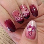
Red and Pink – You can learn a lot from monochrome. It at least strips you from falling back on habits like always stamping with white and black. I think the little chibi would have been much less cute if she were swimming on a flat-colored nail so this is a good example of anchoring a stamp in the middle of the nail. I “anchored” the scene by painting in some hills which also made the stamping relate to the edges of the nail although I still need to work on correct spacing of images that stretch across several nails.
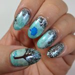
The Hedgehog’s Fairy Tale – I still feel like a little story should accompany this one. Along with gradients, I used framing (with the brown/silver vines) and background stamping to anchor the hedgehog and set the stage. If I could go back in time, I would have stamped the silver pattern behind the tree, then painted in some ground, then stamped in the tree. That way the silver would be representative of plants in the background and not just a pattern I stuck on my nail. As I recall, I wanted to do that right after finishing the nail, but was too tired to start over, alas.
February
I’d branched out to a new (to me) FB challenge in January called 30 Days of Color, a group that has since died from lack of participation. I think FB has killed a lot of such groups since it changed algorithms and demanded people pay to “boost” their posts. But it also looks like the Google+ nail groups are pretty much dead because Instagram is the place to be. What do you think? All I can do is speculate since I came to this so late.
Anyway, I liked the group’s premise, which was a color prompt and then you had to use something you hadn’t tried yet. Joining the group gave me more deadlines and so nail art getting done happened more even though I was just as stressed out as last month…
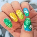
Tourist Season – I love Sinful Color’s Neon Collection because they are still bright, but not so bright that they look utterly hideous with my skin tone. I do not look good in true neons. Nope. I still love this one because: jellyfish and gradient-ed jelly neons give me squishy warm feelings inside. I feel like I’ve been doing gradients a lot less lately and maybe that’s something I need to correct.
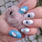
Cats, Cats, Cats – Contrasting color schemes are so, so awesome. Red/green is my favorite, but after that it’s blue/orange (sorry yellow/purple). I love the feeesh in this and also, obviously, cats. Because the amount of nail art I dedicate to cats vs dogs should tell you which camp I am in. I still remember how many times I had to repaint that fish bowl decal though. Uuuuugh!
I seriously need to go through and tag my nail art by color scheme though. At the very least it will help me pull examples fast if I ever start writing/recording tutorials on how to improve your nail art game.
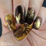
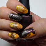
Year of the Rooster vs Rooster Revisited – And here we are at my first fail. In short, this one was way too busy and unfocused. I don’t think you have to have an obvious accent nail every time, but you should be able to grasp what the nail art is about at a quick glance and, for me, this one is just a jumble of lines. I love the recreation so, so much. Chiiickens! 😀
March
I bought more ILNP polishes in March and, happily, they both ended up being part of my favorite manis for the month. Then, because they are very “busy” and rainbow-y, I proceeded to not use those polishes for a year. I am really happy with this year’s Marble Unicorn and it is very likely going to be in my favorites next year. But it kind of bothers me that it took so long to use the ILNP polishes again. I am not planning on buying more storage for my nail polish so what I keep has to weeerk for me. I’d hate to destash these polishes a few years from now.
Anyway, this was a hard month because I either really liked or kinda hated everything I did. Just so you know, my Beauty and the Beast and MLP’s Applejack nail art were loves.
I still want to finish my “mane six” nail art series, but now that my nail shape is so different I might just start over. :p
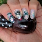
Lady in Sparkle – It is really hard to create steampunk nail art without a single gear or pocket watch or top hat. Nevertheless, I like to think this is steampunk. I use this stamping plate a lot considering the size of my collection and my only question is: When am I going to use the stamping image of shoes? Because I also love it and this level of neglect is just cruel.
Shooooes. 😀
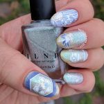
Spring Bee – I did add a few hints of yellow here and there with this nail art, but it’s mostly purple with a little bit of green shimmer from “Spring Bouquet”. I’ve kind of challenged myself to avoid yellow bee manis for as long as possible. I do have a pink and a green though. My favorite thing about this design, however, is the large purple flower. I used a sheer polish to fill in parts of it and I love how it lets the holo of the polish underneath show through.
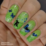
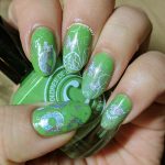
Mixed Tape vs Smile.DK’s Butterfly – For me, this design had too much holo combined with white (which provided no contrast) on top of a holographic green (that also provided no contrast). In short, I am annoyed with the lack of contrast and I also feel like I let myself be too uninspired by the prompt. Now I try to think outside the box on prompts I like less to find nail art I can be excited about or skip it. Hobbies of the Red Queen is a good example of this new resolve.
April
It’s funny how in my head this month was a failure, but when I look at what I did it’s not. The first nail art I posted wasn’t really my style, but it’s okay. In the end, I really only had one #NailFail…
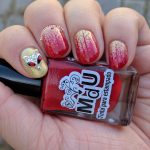
Fox in the Red Wood It’s amusing to me how often I’ve thrown red and yellow together in my designs, but I think this was the first. Stamping with a color I’ve used at the end of my gradient is a great anchoring technique I used long before I started this blog. Plus I will always adore my collection of fox nail charms.
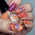
Hippie Boho This was not a subject I felt ready for so I remember googling the phrase and kind of hopelessly looking at the image results. I decided it mean funky print and bright colors. Not a style I’d do often for myself, but seriously fun to paint and look back on.
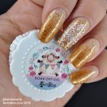
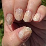
Golden for Office vs Golden for Office 2.0 I hated this one. The prompt “Workplace Appropriate” was just going to be a tough one for me because I know how strict some workplaces are (women seriously need to stop being the main target for dress codes #RapeCulture). So I did something that looked barely there in the spirit of the prompt and hated it. The new version has stronger coloring and a clear accent nail while still being conservative. Win!
May
This month marks the first time I posted freehand nail art to the blog. Which is funny because my first real nail art (that wasn’t blobbing random colors on my nails) was a freehand flag painting for the Fourth of July. As far as #NailFails go, I wish I’d known to throw a matte top coat on top of my super holo cactus nail art, because I think it would have “saved” it for me. Still. I hate Decopunk Pink so much more…
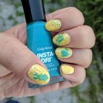
Return to the Yellow Sea I still adore this. The strong geometric feel with the transparent origami critters that you can still see the lines through. Yes! I should revisit this theme again because I have origami images I haven’t used yet. [Edit 1/5/2019: Success with On Violet Waters. Will probably do more someday.]
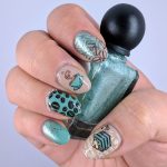
Delicately Coffee I love mint and brown together. I had a mani I painted before the blog that used them and I still look back on it with love in my heart. Sadly, it’s one of the photos I lost. This lovely design will hold me over until I recreate it.
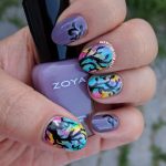
Watercolor Rainbow Trees I love the rainbow-y nature of this nail art and the use of purple (the tutorial uses blue). It’s just a shame I didn’t listen to Robin Moses more and water down the acrylic paint b/c my lines were veeery thick compared to hers.
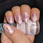
Decopunk Pink vs ? Hate is a strong word that I like to use with this design. It could have been so great and I failed to experiment enough to get it to work. A lilac, pink, and gold color scheme is hard to do with the added element of steampunk. But I know I can make it work. And I will this month! 😀
June
I started being more prolific in June, but because I had no freehand I could only have two favorites. At least there were no fails! One thing I find funny is that this is the month I painted Art Deco Fashion and someone big pinned it because I still get visits from Pinterest. Some days it’s my most popular page on the site. Even now! I kinda wish whoever it was had pinned my monkey nails instead because they are punny. 😉
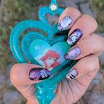
The Little Mermaid 2.0 Sometimes you finish a design and realize you missed something that would have made it even cooler. Usually it’s too late to fix it, but I lucked out this time. Adding the ship and a few seagulls really completed the design.
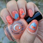
Eternal Hobbies There were a lot of matte looks this month and this one was my favorite. Contrasting color schemes. They just work. Plus who wouldn’t want a tribute to sleeping, reading, and pestering my freeloading cat. 😉
Soft kitty, Warm kitty, Little ball of fur, happy kitty, sleepy kitty, purr purr purr.
July
This was the start of the beach/ocean/nautical themes that it seemed like all the challenges wanted during the next few months. I’d been trying to get more interaction with my audience by letting people vote for matte or glossy finishes on my nail art but even on Instagram where I get the most views I wasn’t getting much of a response. So I gave up. It might work now with Instagram stories, but it’s not something I want to pursue anymore. I try to be blog-first since this is a space I 100% control and where you will always be able to find me no matter where the social scene has drifted. Matte vs Glossy voting on Instagram would change the dynamic to Instagram-first, so nope.
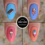
Simply Sugar More wins with matte designs. They are so much easier to photograph and I love how it softens some colors. I absolutely adore this design. It’s not only a mini rainbow, but it’s a celebration of cute food. Yum!
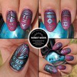
Primary Tribal Print I felt like I came up with a magical formula for this one and then I tried to repeat it with Busy Bees but didn’t follow it closely enough so it failed. The formula is: dark to medium creme monochrome gradient + light metallic finely-milled metallic stamping + matte top coat. KleanColor metallics are not finely-milled, sadly.
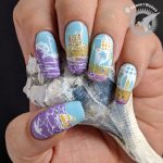
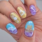
Day at the Beach vs Day at the Beach 2.0 So I actually really like this one, but I feel like I can do it sooo much better now. Besides, my other #NailFail for the month is a design I have no interest in making better. Let it die a quiet death instead.
Until the Next Post!
It may seem weird that I stopped at July instead of June, but August is when I abruptly started doing a lot of nail art. Like…more than one a day. So tomorrow’s post is going to be long enough without July. Plus I will be talking about what colors, nail polish, and stamping plates I used most in 2017 as well. So until tomorrow! (And, yes, it will be tomorrow because everything is already written up. LOL )

Leave a Reply