Woo! I did it! Twenty different designs focusing on twenty Pantone colors for winter. I love that we’re ending on such a bright and powerful color, although I do find it very humorous that this is a winter challenge and it has a color with the word “summer” in it.
(Don’t blame Ine for that! She compiled this list from color trend predictions that other think tanks posted.)
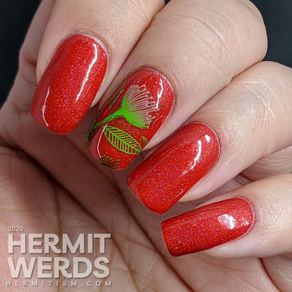
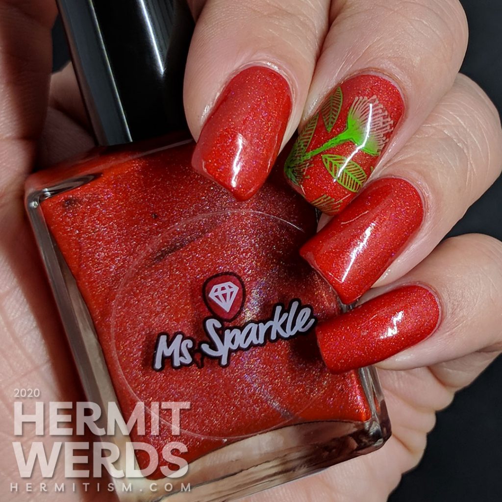
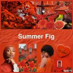
I had quite a time finding a polish that would fit into the realm of Pantone’s Summer Fig. I have quite a few bright orange polishes, but they were all too orange or too dark. Finally I realized I had purchased a polish that was as close as I was going to get during last year’s Black Friday sales: Ms. Sparkle’s “Fiesta“.
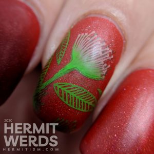
It’s the tomato red that I’ve been looking for for a long time. I just wish it wasn’t matte, since it makes the formula more difficult to work with. Still, it is opaque in two coats so in the end it is still less work than a lot of other reds I own. I do think it’s still available in her store, but she’s on hiatus right now…
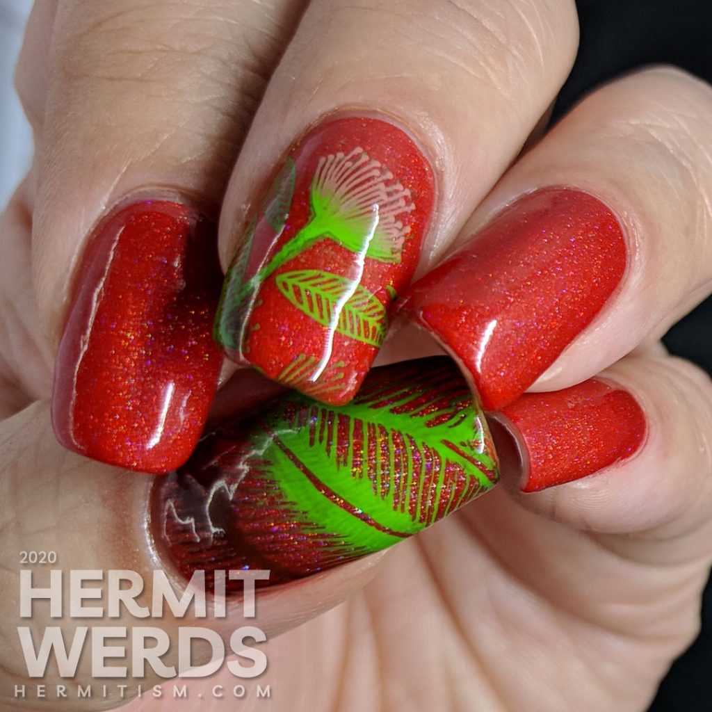
Products used
- Base Polishes:
- Ms. Sparkle’s “Fiesta“
- Stamping Polishes:
- Born Pretty’s “Coral Grapefruit“, and “Orange Autumn” (press sample) and Mundo de Unas’ “Avocado“
- Stamping Plates:
- Maniology BM-S329 (middle finger) and Zjoy-027 (thumb)
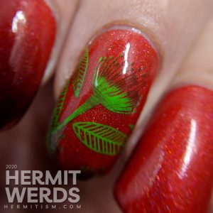
I started off using only the dark red and bright green stamping polishes, but the flower ended up looking odd with the dark tips so I went back and double stamped just the flower head. It works better at a distance where you can’t see the volunteer cat hair, but here are some macros anyway:
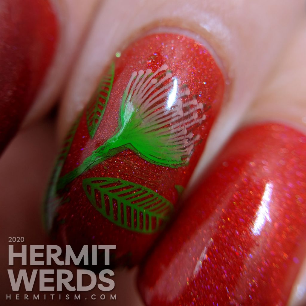
And then my sadly mis-colored flower head, but also the nicer version with some satin top coat.
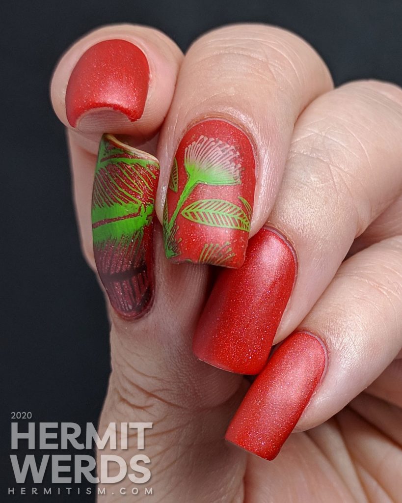
I think matte-ified and with the scattered holo giving it that perfect texture, this polish really reminds me of the texture of the inside of a tomato. Possibly that’s just me. 🤣
#Pantone2019WinterChallenge’s end
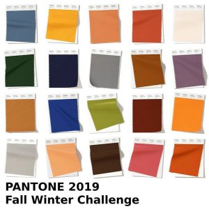
I don’t think I’ve ever posted the challenge image with all the colors before, so let’s get that in first. LOL It’s been a good twenty designs and it’s a little weird that it’s over. They definitely felt very winter-y, although I wouldn’t have flinched if this were called fall at all.
I am pretty happy with most of my work, although a few designs were more lessons for next time. I did end up with a lot of florals, but partly that’s just me trying to hit my use the un-used goals. Sometimes, like with Guacamole, I just didn’t have a color that was close enough. I know some participants purchased colors that they didn’t have, but I already have so much polish so I just made do.
(But I wouldn’t mind finding a proper Guacamole shade. 😜)
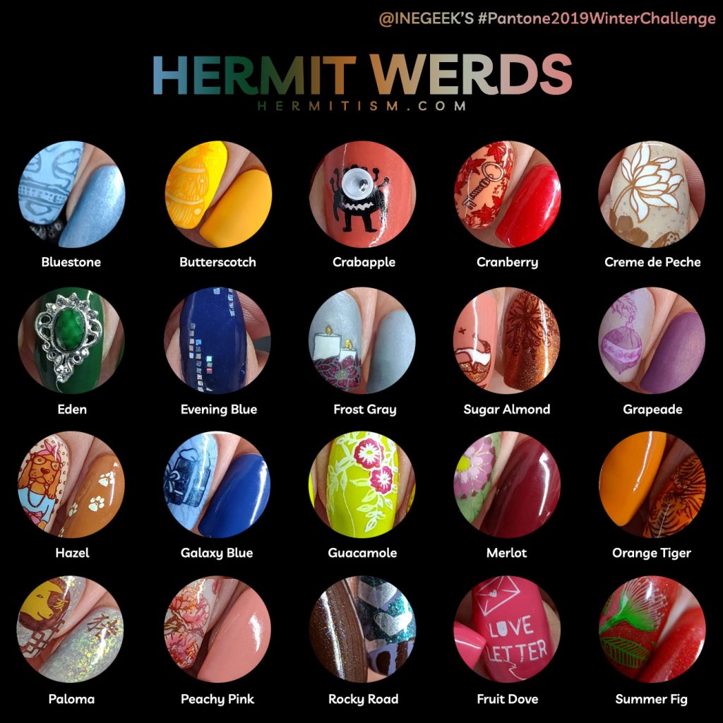
Since we ended up going out of order later on in the challenge, here are the links to the designs from left to right, starting from the top:
Bluestone, Butterscotch, Crabapple, Cranberry, Creme de Peche, Eden, Evening Blue, Frost Gray, Sugar Almond, Grapeade, Hazel, Galaxy Blue, Guacamole, Merlot, Orange Tiger, Paloma, Peach Pink, Rocky Road, Fruit Dove, and Summer Fig (here).
My favorite three colors from this were Grapeade, Guacamole, and Crabapple. But…my three favorite designs ended up being entirely different colors: Creme de Peche, Orange Tiger, and Peach Pink. Did you have any favorites?
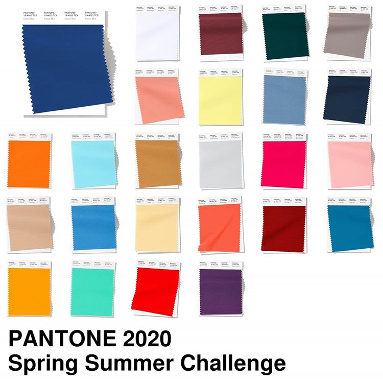
#Pantone2020SpringChallenge
I’m a little sad this lovely challenge has ended but Ine has started up a new spring/summer challenge for the next 25 weeks. I’m pretty sure I can’t resist it, so here we go again! 😱 Until next time, friends! 😘
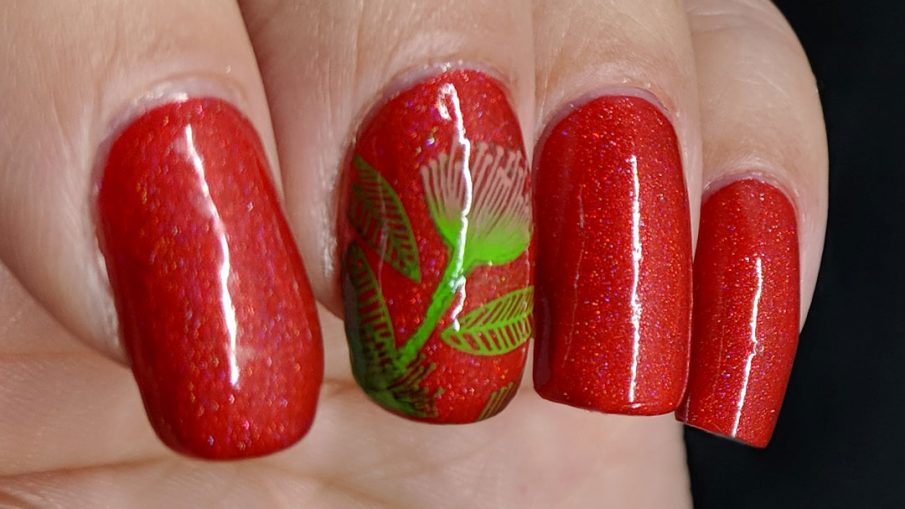
Gorgeous red and nicely stamped! Looks good on the red. Now I like both glossy and matte 😀
Thank you! I think this is definitely one of those manis that looks just as good glossy or matte. 🙂