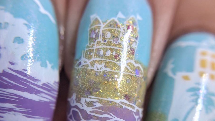
This is a strange little recreate because, for the most part, I loved the original. However, my middle and ring finger didn’t make much sense in the context of the rest of the nail art. I like to show progression or tell a little story and they were more about drinking on the beach, but they felt kind of colorless too because it was just sand and white stamping. I loved the lilac/blue/sand color combo and wanted them on each nail. I also thought the presence of the ocean close by was important. So when I redesigned this I decided to make it more of a panoramic view and yet…not since clearly the sand castle is not to scale with the buildings or the waves. Possibly I should have left it out, but I really liked it, so… 😉
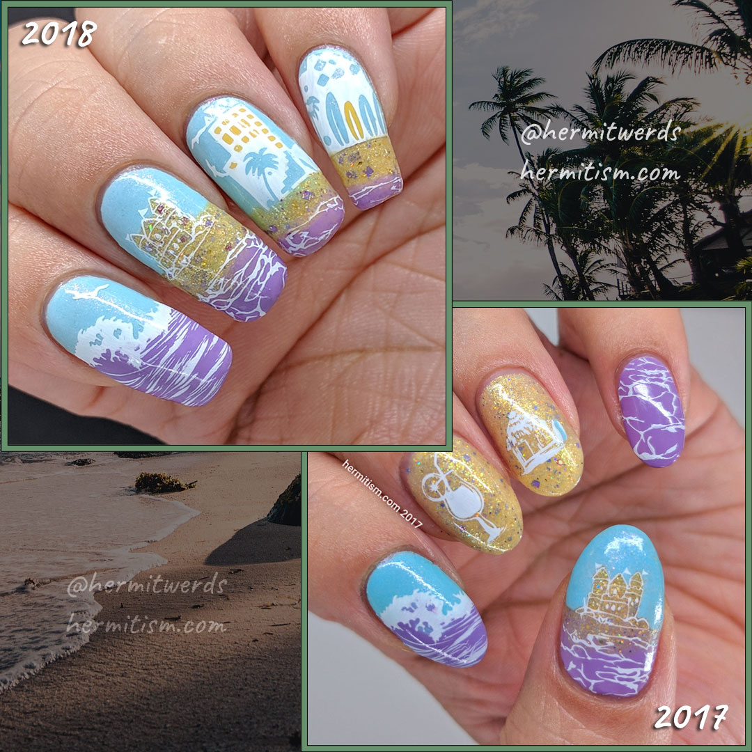
- Base Polish:
Sinful Colors’ Kandee Johnson “Flip Tease” - Stamping Polish:
Mundo de Unas’ “White” - Advanced Stamping Polishes:
Heather’s Hues’ “Sunshine and Pansies”, OPI’s “Never a Dulles Moment”, Sinful Colors’ “Tempest” (mixed w/clear polish for gradients), and Sinful Colors’ Kandee Johnson “Flip Tease” - Stamping Plates:
Bundle Monster BM-502 (boat), BM-504 (wave), BM-509 (water, sand castle), and Polynesia BM-XL107 (buildings), CjS LC-11 (sea birds)
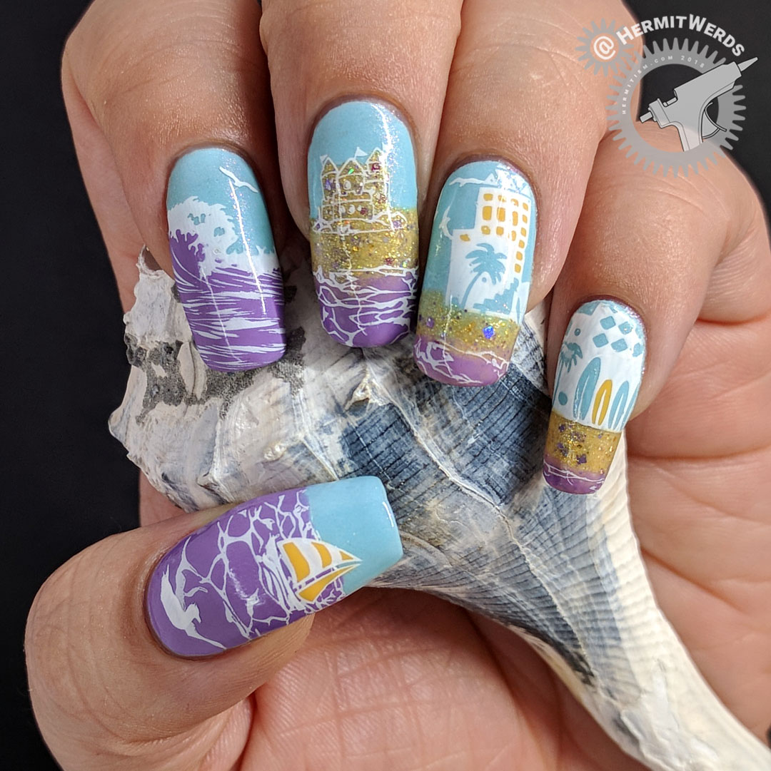
Getting smaller stamping images to fit the nail
Now when it came to my thumb I pulled a lazy that you can only barely see. You see, my nails are fairly wide so the stamping images on Bundle Monster’s circle plates do not stretch across my whole thumbnail. So I just filled in the image with purple and stuck it to my nail on the side that would end up in my photos and left it. There’s a whole edge where the lines abruptly end. Laziness achieved! However, if I had been worried about others seeing it, I would have grabbed a second image of the waves, painted clear polish on top, pulled it off the stamper, flipped it, stuck it down on the first image so the lines met, painted more clear polish on top and filled that in when the clear polish was dry.
I would still have positioned the image the same because seeing too much of the second stamp would have made it very obvious it was a poorly designed repeating pattern.
Now if I hadn’t been making it into a decal, I would have used a squishy stamping head, pulled it out of the holder, and streeetched the image by pinching the stamper head as I rolled it across the nail. I used this on the background stamping on My Mermaid Has Crabs because the image I wanted to use was so narrow it wouldn’t even fit across my ring finger. This sort of technique works if the stamping image is abstract and organic. I would not use it for anything geometric or rigidly patterned. Definitely not on a picture of something like a cat. You may get it to fit, but it will be a misshapen monster.
So only do that if you’re making misshapen monster nails. That would be fun. 🙂
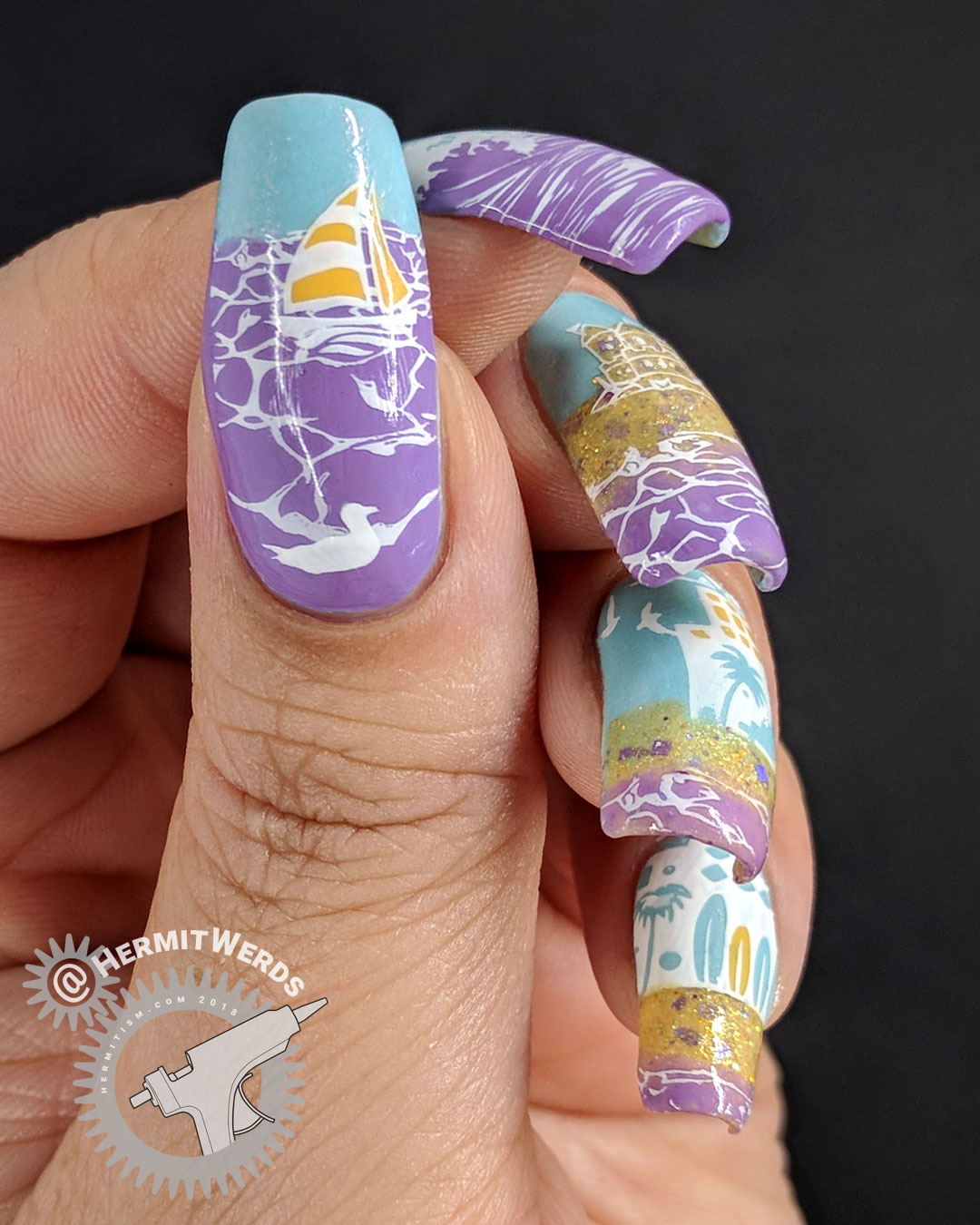
Layering all the decals was obnoxiously hard. I ended up having to re-paint my ring and pinky nails. I’d initially started by painting all of my nails blue, but I was covering up so much of it that it felt pointless. So on my second try I made full nail decals instead. Then I added the ocean decal on top of that. To get the ocean to kind of fade into beach I used clear polish to jelly-ify it into a gradient. I used the same trick on the original and love it still.
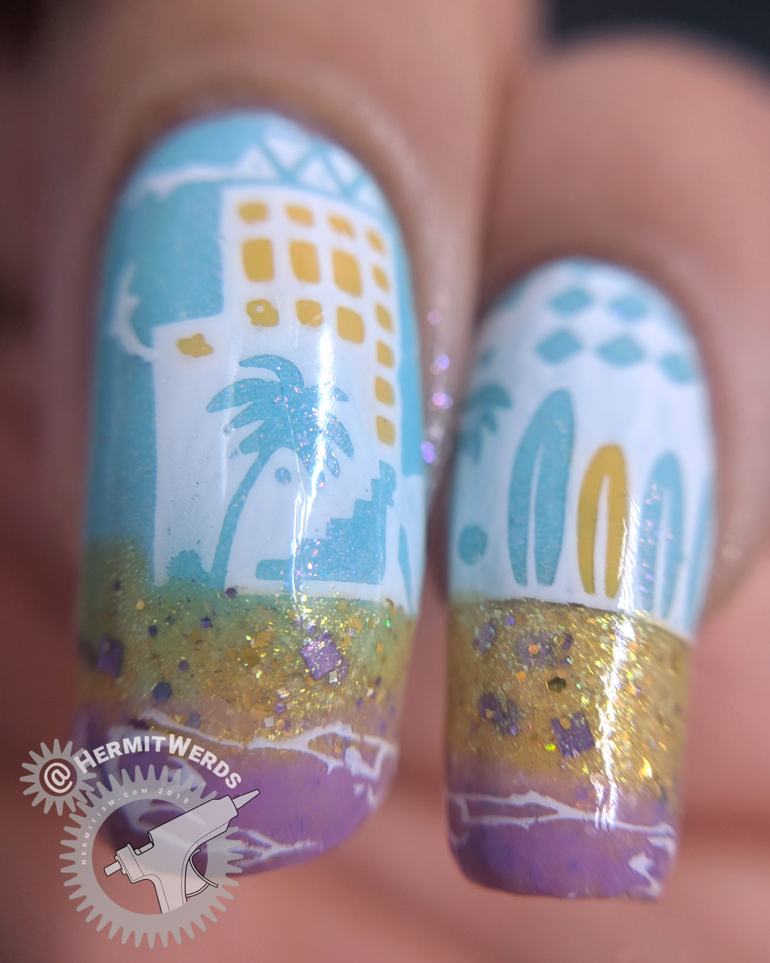
I really need to use Heather’s Hues’ “Sunshine and Pansies” for something other than sand because it’s so lovely. Every time I feel sad about limiting how many new polishes I buy, I remind myself of the pleasure in using what I already have and how I always feel like I should be using everything more…somehow…and also freehanding more while getting lots of use out of my stamping plates. So many contradictions. LOL
Leave a Reply