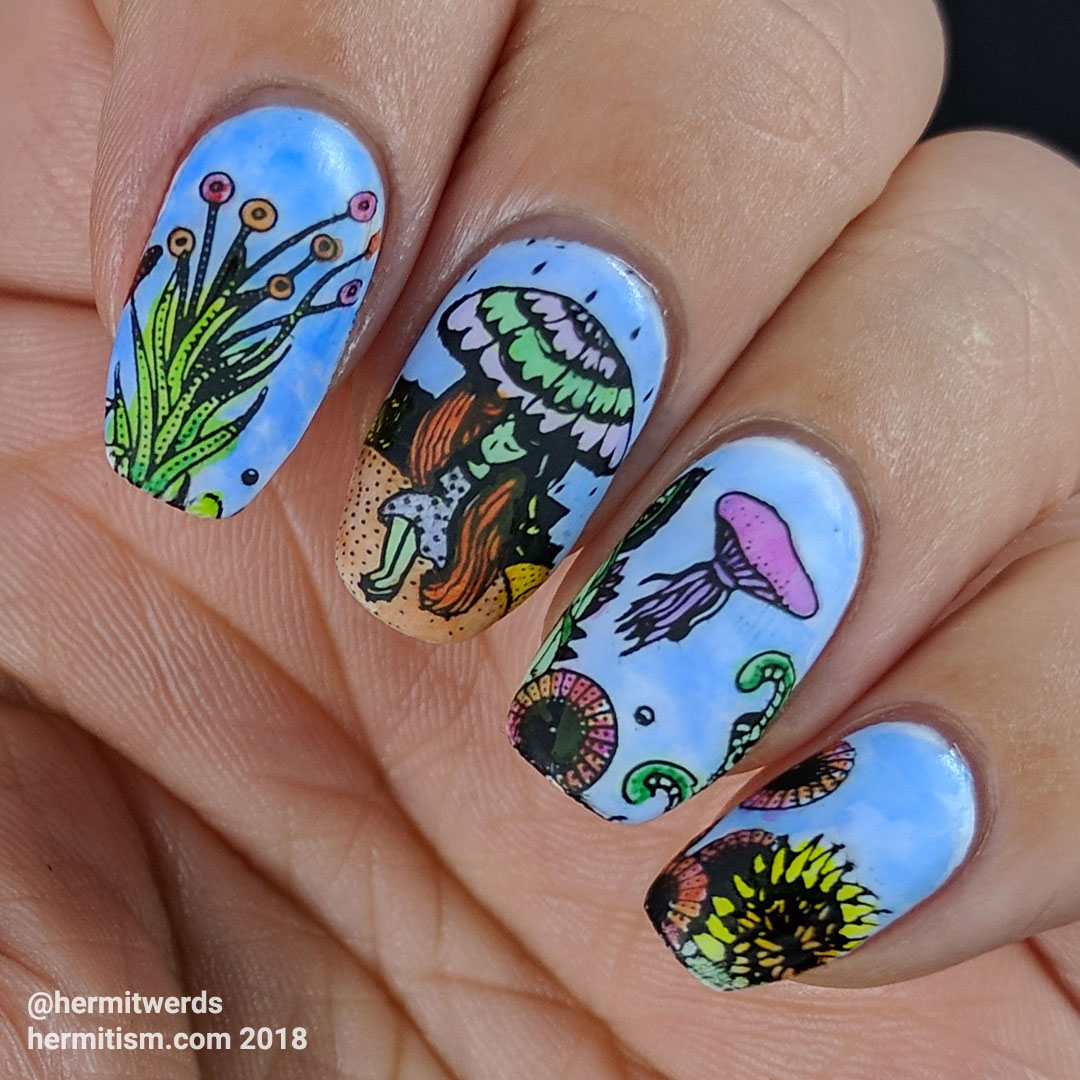
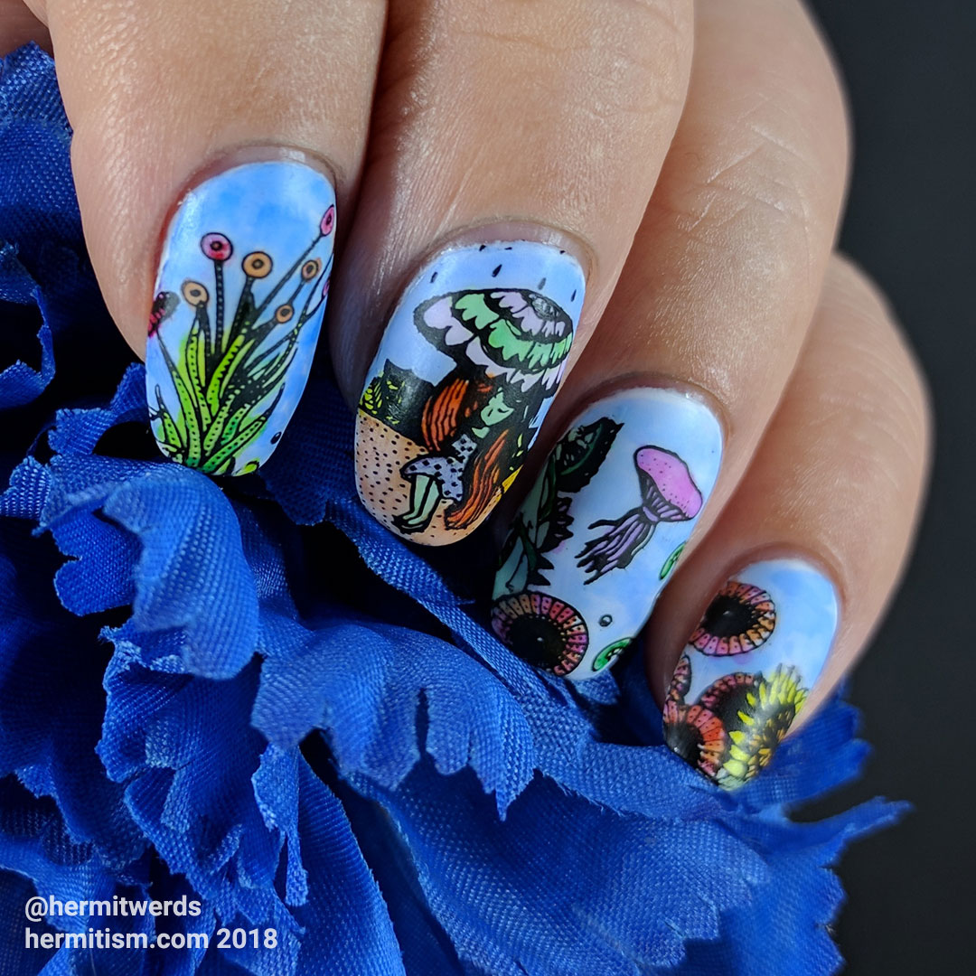
So, yeah. I’m behind. Between playing Don’t Starve (the old distraction, which I haven’t even touched once for over 24 hours /sob) and moving my blog and breaking it (the new distraction, shoot me), I missed a few prompts from #nailartchallenge. Namely Fish and Umbrella. I figure my previous prompt mani had kinda combo-ed Fish in, but it influenced me to do a weird underwater surreal mani for Umbrella. So here it is, totally late. It amuses the heck out of me and I also wish my nails were longer so I could have fit in more details. Like an actual rain of fish. hehehe

- Reusable white gel base
- Stamping Polishes:
Mundo de Unas’ “Black” - Colored in with sharpie markers and rubbing alcohol on a matte base.
- Stamping Plates:
ZJoy-023
This was actually my second mani for today done with sharpie markers, but you’re seeing this one first. I will talk more about what happened when I was painting on a glossy top coat, but in this one I painted my sharpie ink diluted with rubbing alcohol on top of a matte top coat. I even directly scribbled on my nails a bit. Just like with Rainbow City I experienced very little bleeding of pigment once the color was placed down. This makes blending really hard but, considering how much bleeding and smearing I experienced with the first mani, I think I will use a matte top coat from now on unless I want a veeery soft and blended look. It was very frustrating. I only have one spot on this mani where pigment ended up where I didn’t want it. It happened because I loaded my brush with too much rubbing alcohol. Avoidable mistakes are so frustrating. 🙂
Can you spot where I messed up?

On top of moving the blog, I decided to wander into the realm of re-branding a little bit at a time. I had wanted to do it all at once, but I’ve got too many things to edit right now so this is the pace we have to live with. So far I’m liking the new header images. They are cleaner-looking and have lots of space for longer blog titles. Feel free to share your opinions as well. Are they an improvement?
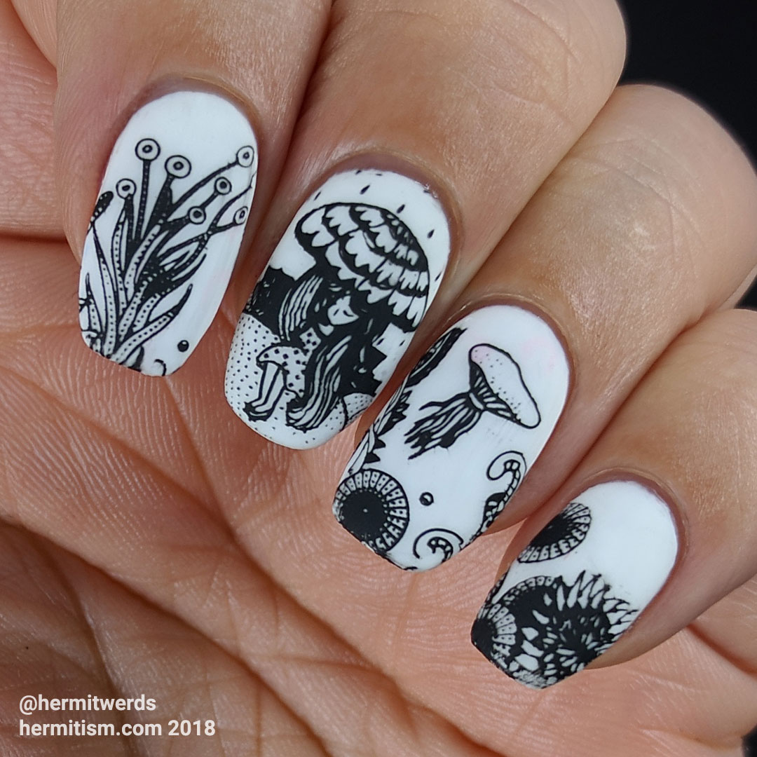
And here’s one last look at the outlines I had to work with. ZJoy stamping plates are so underestimated. I really, really want to use them more and that’s good since I have several I haven’t used yet and I’m in a sort of buying freeze because I have so many things I haven’t used(/enough) yet. Their super detailed-ness will have to make up for not adding to my collection of Creative Shop stamping plates during all the sales in the last few months. So many things to covet and not even enough time to play with everything I already have. /sigh May my problems always be this delightful.


Leave a Reply