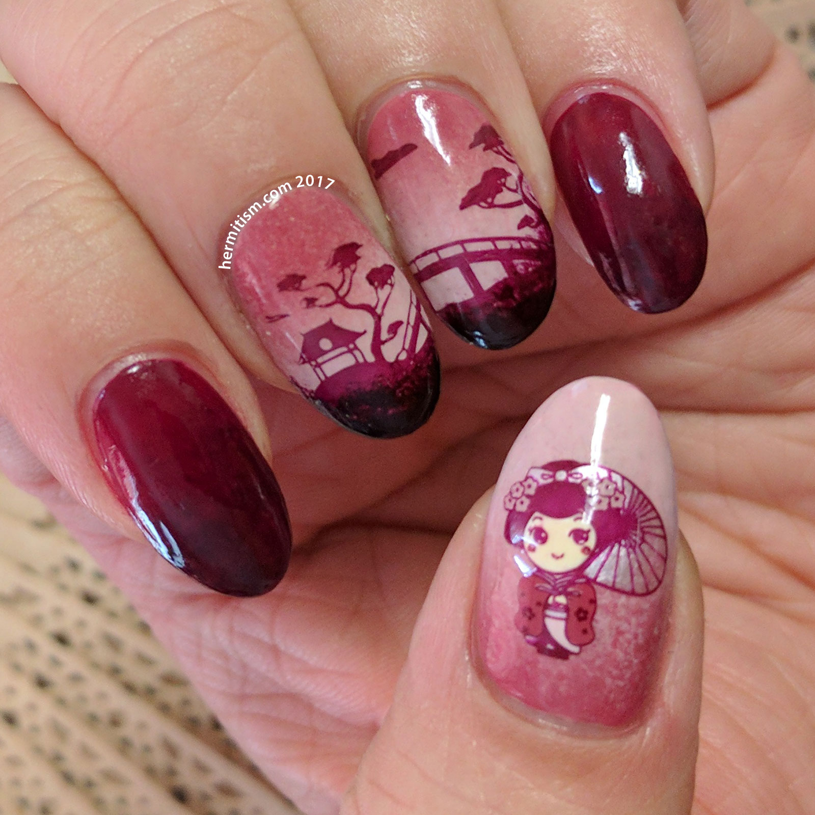
It’s very close to Valentine’s Day, but I wanted to stay as far away from that theme as possible (not a big fan of the holiday). Then I saw Midnight Stamper’s “Calm” post for a challenge group I had never heard of before and used the group’s over-arching theme (use things you’ve purchased and haven’t played with yet) to guide me.
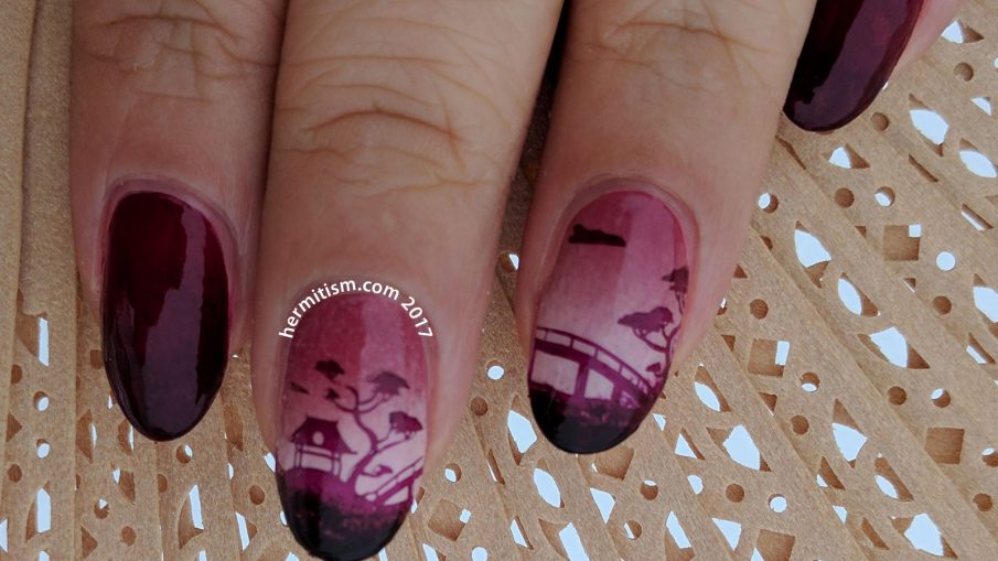
I’d purchased UberChic Beauty’s Far East-02 stamping plate last year and, to my sorrow, still hadn’t used it yet. Win. I even had an untried red-ish polish too.
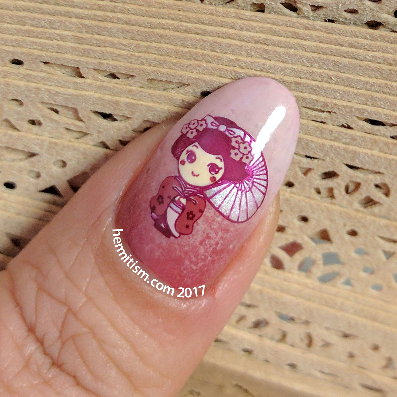
I was a little worried that the polish I was using for stamping was not opaque enough, but since I was stamping on a the light parts of my gradients, it turned out okay. I’d initially planned on filling in the space under the house/bridge with more of the same color since it wouldn’t reach the tip of my nail. I still did that, but I sponged it on instead of just painting it to make the color mis-match look intentional. It ended up adding more depth to the nail so very happy about that. (Usually I prefer taking photos outside, but, as you can see, they turned out darker today.)

- Light Base Gradient: Essie’s “Mrs Always Right”, Cherry Tree’s dusty rose, Sinful Colors’ Kylie “Kitty Pink”
- Dark Base Gradient: ULTA’s “Bittersweet”, and Revlon’s Perfumerie “Bordeaux”
- Stamping Polish: ULTA’s “Bittersweet” (this is not a good polish to use if you want an opaque stamp)
- Reverse Stamping Polishes: Essie’s “Mrs Always Right”, Sinful Colors’ Kylie “Kitty Pink”, and Sinful Colors’ “Tokyo Pearl” and “Daisy Daze”, Essence’s “Wild White Ways” (used under the flesh colors to ensure they stayed the right shade)
- Stamping Plates: UberChic’s The Far East-02

I wanted to 100% stick to red and pink polishes only, but I wanted the colors in the decals to stand out. So I compromised by using Sinful Color’s “Tokyo Pearl” which is a four-coater pearly white. I tried to dab it on lightly enough so the pink background would show through and tint it.
Crumpet’s Nail Tarts’ 26 Great Nail Art Ideas (2017) – Pink and Red:
30 Days of Color (Jan 2017) – Calm:

This is so lovely! I love the depth you achieved with the gradient and the landscape image. I think it really works well for the “calm” theme.
P.S. Thanks for the shout-out! 😀
Thank you! I was hoping it would (although I hope to be doing separate manis for them next week). I’m liking the “new” challenge group since they seem much more relaxed about participation.
These are amazing, you did such a great job! And those colours together are fabulous!
Thank you! I was watching a video on mastering color recently and realized I should focus more on what color schemes I am using in my nail art. 🙂
This is stunning! I love the gradient behind the stamping! <3
Thank you! I love how it adds depth to a nail design so I’ll probably be over-using the technique for a while. ;D